 DEVELOPERS DOCS
UI Element Examples
- API Token & Secret Values
- Checkboxes
- Tooltips
- Multi Selection
- Creatable Multi Select
- Codemirror (json/sql/python..) Editor
- Trimmed String
- Date Range
- Loading Options (Incremental vs Full)
- Visual Separation of Sections
- Conditionally Showing Fields Based on Selection
- Tooltips and Documentation Links
- Radio Buttons
- Date Picker
- Grid Layout
- Collapsible Sections
- Disabled Fields
- Info Blocks
JSON schema allows for design of some advanced UI elements. Some of these are often reused in many components. This page contains a list of the commonly used UI elements and some advanced tips for UI design.
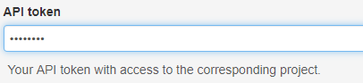
API Token & Secret Values
Always prefix private parameters like passwords with # character. These will be automatically hashed and hidden from the view.
Use a textual input field with "format":"password" in the JsonSchema for these values to hide the content also during the typing.
{
    "#api_token": {
        "type": "string",
        "title": "API token",
        "format": "password",
        "propertyOrder": 1
    }
}
The above code will create the following user interface:
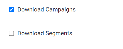
Checkboxes
{
    "campaigns": {
        "type": "boolean",
        "title": "Download Campaigns",
        "default": false,
        "format": "checkbox",
        "propertyOrder": 30
    },
    "segments": {
        "type": "boolean",
        "title": "Download Segments",
        "default": false,
        "format": "checkbox",
        "propertyOrder": 40
    }
}
The above code will create the following user interface:
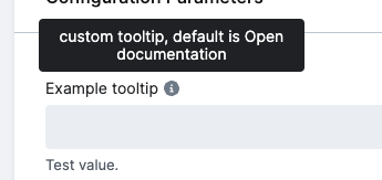
Tooltips
Additional description with optional links
{
  "test_tooltip": {
    "type": "string",
    "title": "Example tooltip",
    "options": {
      "tooltip": "custom tooltip, default is Open documentation"
    },
    "description": "Test value.",
    "propertyOrder": 1
  }
}
The above code will create the following user interface:
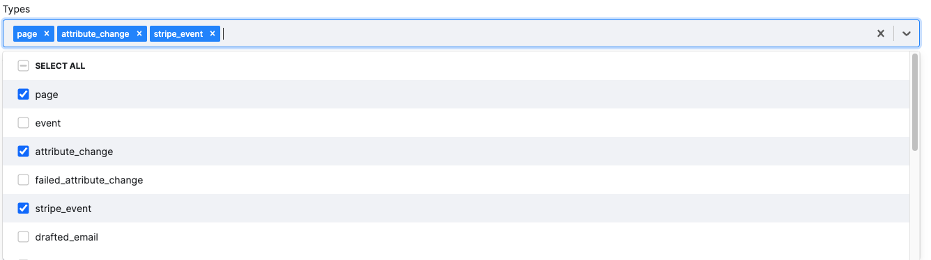
Multi Selection
{
    "types": {
        "type": "array",
        "title": "Types",
        "description": "Activity types",
        "items": {
            "enum": [
                "page",
                "event",
                "attribute_change",
                "failed_attribute_change",
                "stripe_event",
                "drafted_email",
                "failed_email",
                "dropped_email",
                "sent_email",
                "spammed_email",
                "bounced_email",
                "delivered_email",
                "triggered_email",
                "opened_email"
            ],
            "type": "string"
        },
        "format": "select",
        "uniqueItems": true,
        "propertyOrder": 360
    }
}
The above code will create the following user interface:
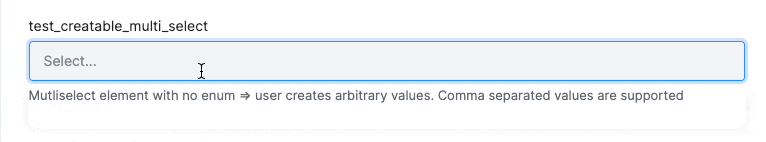
Creatable Multi Select
Multi select with user creatable values
{
  "test_creatable_multi_select": {
    "propertyOrder": 50,
    "type": "array",
    "items": {
      "type": "string"
    },
    "format": "select",
    "options": {
      "tags": true
    },
    "description": "Multi-select element with no enum => user creates arbitrary values. Comma-separated values are supported.",
    "uniqueItems": true
  }
}
The above code will create the following element:
Codemirror (json/sql/python..) Editor
Allow inject Codemirror editor to a JSON schema based UI.
Allowed options: mode, placeholder, autofocus, lineNumbers lint
Available modes: text/x-sfsql, text/x-sql, text/x-plsql, text/x-python, text/x-julia, text/x-rsrc, application/json
JSON mode supports encryption. Default mode is application/json . You should set type base on mode (string or object).
JsonSchema examples:
{
  "token": {
    "type": "object",
    "format": "editor"
  }
}
{
  "sql": {
    "type": "string",
    "format": "editor",
    "options": {
      "editor": {
        "mode": "text/x-sql"
      }
    }
  }
}
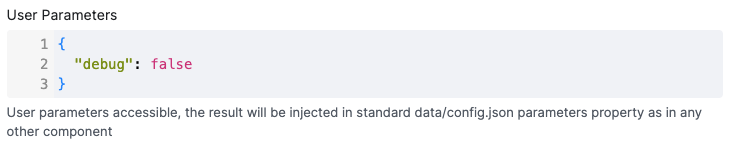
{
  "json_properties": {
      "type": "object",
      "title": "User Parameters",
      "format": "editor",
      "default": {
        "debug": false
      },
      "options": {
        "editor": {
          "lint": true,
          "mode": "application/json",
          "lineNumbers": true,
          "input_height": "100px"
        }
      },
      "description": "User parameters accessible, the result will be injected in standard data/config.json parameters property as in any other component",
      "propertyOrder": 1
    }
}
The above code will create the following element:
Trimmed String
Works only for simple string inputs. Value is trimmed before save.
JsonSchema example:
"token": {
  "type": "string",
  "format": "trim"
}
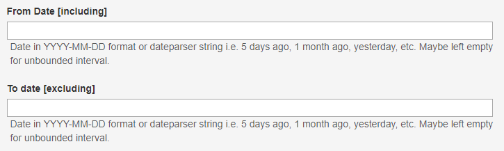
Date Range
When a date range is applicable, it should be bounded by two parameters: From Date and To Date. These should be the text fields that accept a particular date in a specified format or a string defining a relative interval in strtotime manner.
Tip: A convenient Python function for parsing such values and conversion to date can be found in the Keboola python-utils library (parse_datetime_interval).
{
    "date_from": {
        "propertyOrder": 5,
        "type": "string",
        "title": "From date [inclusive]",
        "description": "Date from. Date in YYYY-MM-DD format or a string i.e. 5 days ago, 1 month ago, yesterday, etc. If left empty, all records are downloaded."
    },
    "date_to": {
        "propertyOrder": 7,
        "type": "string",
        "title": "To date [exclusive]",
        "default": "now",
        "description": "Date to. Date in YYYY-MM-DD format or a string i.e. 5 days ago, 1 month ago, yesterday, etc. If left empty, all records are downloaded."
    }
}
The above code will create the following user interface:
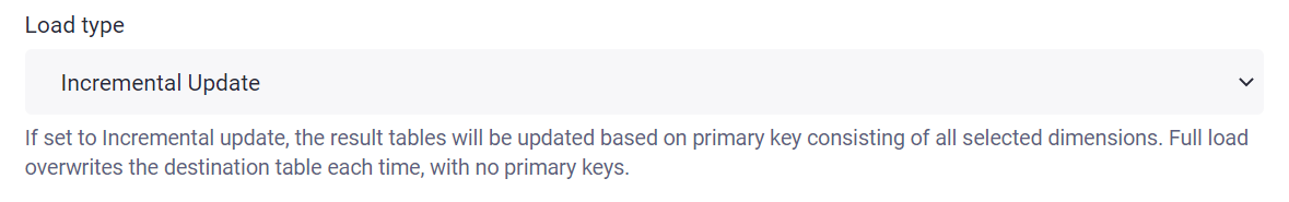
Loading Options (Incremental vs Full)
This may be combined in loading options block.
{
    "incremental_output": {
        "type": "number",
        "enum": [
            0,
            1
        ],
        "options": {
            "enum_titles": [
                "Full Load",
                "Incremental Update"
            ]
        },
        "default": 1,
        "title": "Load type",
        "description": "If set to Incremental update, the result tables will be updated based on the primary key. Full load overwrites the destination table each time. NOTE: If you wish to remove deleted records, this needs to be set to Full load and the Period from attribute empty.",
        "propertyOrder": 365
    }
}
The above code will create the following user interface:
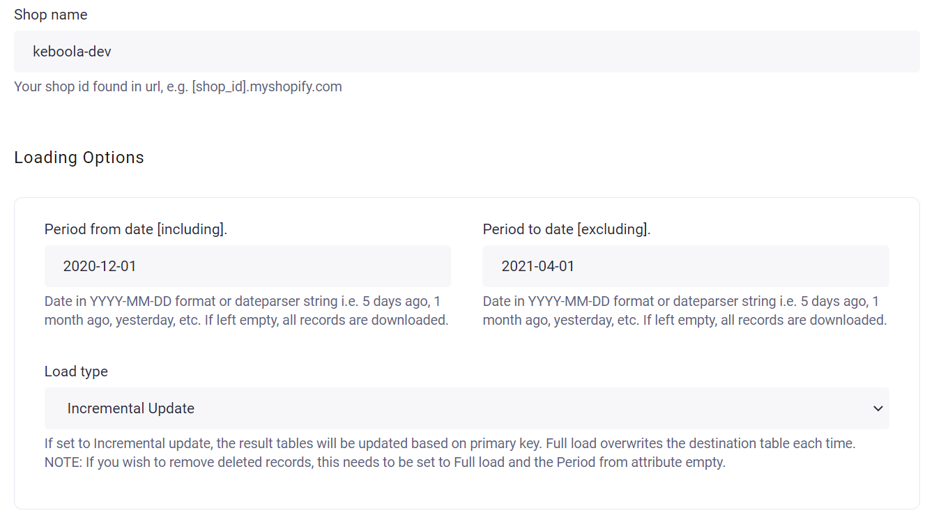
Visual Separation of Sections
It often happens that the configuration can be split into multiple sections. It is advisable to split these visually using JSON Schema objects or arrays to achieve it using the generic UI.
Example 1 – Object blocks (loading options)
Loading options block:
{
    "loading_options": {
        "type": "object",
        "title": "Loading Options",
        "propertyOrder": 400,
        "format": "grid",
        "required": [
            "incremental_output",
            "date_since",
            "date_to"
        ],
        "properties": {
            "date_since": {
                "type": "string",
                "title": "Period from date [including].",
                "default": "1 week ago",
                "description": " Date in YYYY-MM-DD format or dateparser string, i.e., 5 days ago, 1 month ago, yesterday, etc. If left empty, all records are downloaded.",
                "propertyOrder": 300
            },
            "date_to": {
                "type": "string",
                "title": "Period to date [excluding].",
                "default": "now",
                "description": " Date in YYYY-MM-DD format or dateparser string, i.e., 5 days ago, 1 month ago, yesterday, etc. If left empty, all records are downloaded.",
                "propertyOrder": 400
            },
            "incremental_output": {
                "type": "number",
                "enum": [
                    0,
                    1
                ],
                "options": {
                    "enum_titles": [
                        "Full Load",
                        "Incremental Update"
                    ]
                },
                "default": 1,
                "title": "Load type",
                "description": "If set to Incremental update, the result tables will be updated based on the primary key. Full load overwrites the destination table each time. NOTE: If you wish to remove deleted records, this needs to be set to Full load and the Period from attribute empty.",
                "propertyOrder": 450
            }
        }
    }
}
The above code will create the following user interface:
Example 2 – Optional blocks using arrays
Create an array with parameter "maxItems": 1 to create optional blocks.
{
    "customers": {
        "type": "array",
        "title": "Customers",
        "description": "Download Customers.",
        "propertyOrder": 4000,
        "maxItems": 1,
        "items": {
            "type": "object",
            "title": "Setup",
            "required": [
                "filters",
                "attributes"
            ],
            "properties": {
                "filters": {
                    "type": "string",
                    "title": "Filter",
                    "description": "Optional JSON filter, as defined in https://customer.io/docs/api-triggered-data-format#general-syntax. Example value: {\"and\":[{\"segment\":{\"id\":7}},{\"segment\":{\"id\":5}}]} If left empty, all users are downloaded",
                    "format": "textarea",
                    "propertyOrder": 1
                },
                "attributes": {
                    "type": "string",
                    "title": "Attributes",
                    "format": "textarea",
                    "options": {
                        "input_height": "100px"
                    },
                    "description": "Comma-separated list of required customer attributes. Each customer may have different set of columns, this is to limit only to attributes you need. All attributes are downloaded if left empty.",
                    "uniqueItems": true,
                    "propertyOrder": 700
                }
            }
        }
    }
}
The above code will create the following user interface:
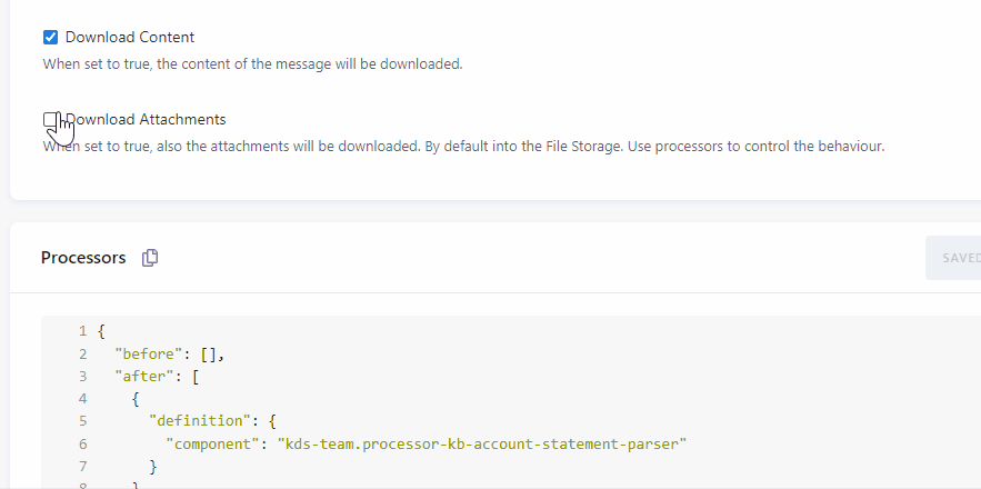
Conditionally Showing Fields Based on Selection
In some cases, additional options should only be shown when a related setting is enabled, e.g., when a particular report feature is turned on. JSON Schema UI options allow you to control field visibility based on the values of other fields. This may be useful in configuration rows, where each row can expose extra options depending on how a user configures it.
This can be achieved via options.dependencies. When the dependency conditions are met, the field is shown; otherwise it is hidden.
{
  "type": "object",
  "title": "extractor configuration",
  "required": [
    "download_attachments"

  ],
  "properties": {
    "download_attachments": {
      "type": "boolean",
      "format": "checkbox",
      "title": "Download Attachments",
      "description": "When set to true, also the attachments will be downloaded. By default into the File Storage. Use processors to control the behaviour.",
      "default": false,
      "propertyOrder": 300
    },
    "attachment_pattern": {
      "type": "string",
      "title": "Attachment Pattern",
      "description": "Regex pattern to filter particular attachments, e.g., to retrieve only pdf file types use: .+\\.pdf If left empty, all attachments are downloaded.",
      "default": ".+\\.csv",
      "options": {
        "dependencies": {
          "download_attachments": true
        }
      },
      "propertyOrder": 400
    }
  }
}
The above code will create the following user interface:
You can also react on multiple array values or on multiple elements at the same time.:
"options": {
  "dependencies": {
    "endpoint": [
      "analytics_data_breakdown_by_content", "analytics_data_breakdown_by_object"
    ],
    "filtered": false
  }
}
You can also reference nested fields using dot notation with a root. prefix:
"options": {
  "dependencies": {
    "root.credentials.#api_token": ""
  }
}
This shows the field only when the #api_token field inside the credentials object is empty.
Tooltips and Documentation Links
Use options.tooltip to add a help icon next to the field label. The tooltip content supports Markdown syntax:
{
    "api_key": {
        "type": "string",
        "title": "API Key",
        "options": {
            "tooltip": "Your API key from the [dashboard](https://example.com/dashboard).\n\n**Note:** Keep this value secret."
        }
    }
}
Use options.documentation to add a clickable documentation link icon:
{
    "query": {
        "type": "string",
        "title": "SQL Query",
        "options": {
            "documentation": {
                "link": "https://docs.example.com/sql-reference",
                "tooltip": "Open SQL reference"
            }
        }
    }
}
Radio Buttons
Use format: "radio" with an enum to render radio buttons instead of a dropdown:
{
    "output_format": {
        "type": "string",
        "title": "Output Format",
        "enum": ["csv", "json", "parquet"],
        "format": "radio",
        "default": "csv",
        "propertyOrder": 1
    }
}
Date Picker
Use format: "date" for a date input with a calendar picker. Values are stored as YYYY-MM-DD strings:
{
    "start_date": {
        "type": "string",
        "title": "Start Date",
        "format": "date",
        "propertyOrder": 1
    }
}
Grid Layout
Use format: "grid" or format: "grid-strict" on an object to arrange its properties in a responsive 12-column grid.
Each property can specify options.grid_columns (1–12) to control its width. Use options.grid_break to force a new row:
{
    "connection": {
        "type": "object",
        "title": "Connection",
        "format": "grid-strict",
        "properties": {
            "host": {
                "type": "string",
                "title": "Hostname",
                "propertyOrder": 1,
                "options": { "grid_columns": 8 }
            },
            "port": {
                "type": "integer",
                "title": "Port",
                "propertyOrder": 2,
                "options": { "grid_columns": 4 }
            },
            "database": {
                "type": "string",
                "title": "Database",
                "propertyOrder": 3,
                "options": { "grid_break": true }
            }
        }
    }
}
Collapsible Sections
Use options.collapsed on an object to make it collapsible. Set options.disable_collapse to prevent the user from collapsing it:
{
    "advanced": {
        "type": "object",
        "title": "Advanced Settings",
        "options": {
            "collapsed": true
        },
        "properties": {
            "timeout": { "type": "integer", "title": "Timeout" }
        }
    }
}
Disabled Fields
Use options.enabled: false to render a field as read-only:
{
    "locked_field": {
        "type": "string",
        "title": "Locked Value",
        "default": "Cannot be changed",
        "options": {
            "enabled": false
        }
    }
}
Info Blocks
Use format: "info" to display a static informational message. The title property is used as the message text:
{
    "notice": {
        "title": "This component requires an API token to function.",
        "format": "info",
        "propertyOrder": 1
    }
}
Alert Type
By default, info blocks render as an informational (blue) alert. Use options.alert_type to change the visual style. Supported values: "info" (default), "warning", "error", "success".
{
    "missing_token_warning": {
        "title": "WARNING: API token is required!",
        "format": "info",
        "options": {
            "alert_type": "warning"
        }
    }
}
{
    "config_error": {
        "title": "Configuration is invalid.",
        "description": "Please check the required fields below.",
        "format": "info",
        "options": {
            "alert_type": "error"
        }
    }
}
Info blocks can be combined with options.dependencies to show warnings conditionally:
{
    "missing_token_warning": {
        "title": "WARNING: API token is required!",
        "format": "info",
        "options": {
            "alert_type": "warning",
            "dependencies": {
                "root.credentials.#api_token": ""
            }
        }
    }
}