 DEVELOPERS DOCS
Configuration Schema
The default input for a component configuration is a JSON text area.
If you define a JSON schema, we are able to display a nice form and let the user to fill the JSON using a set of defined inputs.
Using the configuration schema also allows us to validate the user input on frontend.
Creating Schema
JSON schemas are well documented on the json-schema.org website.
We use RJSF (React JSON Schema Form) for rendering schemas into forms. The schema supports standard JSON Schema properties as well as custom extensions documented in UI Element Examples and Sync Action Examples.
Supported Formats
The following format values are supported in property definitions. The Type column shows the underlying JSON Schema type; italicized entries are descriptive notes, not literal type values.
| Format | Type | Description |
|---|---|---|
password |
string | Masked password input with show/hide toggle |
textarea |
string | Multi-line text area |
editor |
string/object | CodeMirror code editor (JSON, SQL, Python, etc.) |
date |
string | Date picker input |
checkbox |
boolean | Checkbox toggle |
radio |
string | Radio button group (requires enum) |
trim |
string | Standard text input with automatic whitespace trimming |
grid / grid-strict |
object | Responsive grid layout for grouped fields |
tabs / tabs-top / categories |
object | Tabbed layout for grouped fields |
table |
array | Editable table for arrays of objects |
info |
any JSON Schema type | Static informational alert (uses title as message; Keboola UI extension) |
ssh-editor |
object | SSH key/form editor |
sync-action |
Keboola UI button widget | Action button triggering a sync action (not a JSON Schema type) |
test-connection |
Keboola UI button widget | Connection test button (not a JSON Schema type) |
Supported Options
The following options keys can be used in property definitions:
| Option | Description |
|---|---|
options.async |
Dynamic option loading via sync actions. See Sync Action Examples. |
options.dependencies |
Conditional field visibility based on other field values. See Dynamic Options. |
options.tags |
Enable tag-style input for multi-select arrays |
options.creatable |
Allow user-created values in select dropdowns |
options.tooltip |
Help text displayed as a tooltip icon next to the field label. Supports Markdown syntax. |
options.documentation |
Documentation link rendered as a book icon next to the field label. Value: { "link": "https://...", "tooltip": "optional hover text" } |
options.enum_titles |
Display labels for enum values |
options.hidden |
Hide the field from the UI |
options.collapsed |
Start object sections in collapsed state |
options.disable_collapse |
Prevent collapsing of object sections |
options.enabled |
Set to false to disable a field |
options.grid_columns |
Number of grid columns (1–12) in grid/grid-strict layouts |
options.grid_break |
Force a new row in grid layouts |
options.editor |
CodeMirror editor options: mode, lineNumbers, lint, input_height |
options.input_height |
Height for textarea fields (e.g., "100px") |
options.inputAttributes |
HTML input attributes (e.g., placeholder) |
options.only_keys |
SSH editor variant showing only key fields |
options.disable_array_add |
Disable adding items to arrays |
options.disable_array_delete |
Disable removing items from arrays |
options.disable_array_reorder |
Disable reordering items in arrays |
Developing and Previewing Schemas
When building or iterating on a configuration schema, you need a way to see how your JSON schema renders as a form. The recommended approach is to use the live schema editor built into the Keboola UI.
Live Schema Editor in Keboola UI (Recommended)
The Keboola UI includes a built-in live schema editor that lets you edit a JSON schema and immediately see the rendered form side by side. This is the fastest way to iterate on your schema during development.
How to use it:
- Open any component configuration page in the Keboola UI (e.g.,
https://connection.keboola.com/admin/projects/<project-id>/components/<component-id>/<config-id>). - Press Ctrl+D (or Alt+D / Option+D on Mac) while on the configuration page.
- Use the arrow button in the panel toolbar to move the editor to the left or right side of the screen.
- Click the checkmark button to apply the schema override for the current browser session.
- Press Ctrl+D again (or click the close button) to hide the editor.
This editor uses the same RJSF rendering library as the production UI, so what you see in the editor is exactly what end users will see. The override is local to your browser session — it does not change the schema registered in the Developer Portal.
Generating Schemas with AI Kit
You can also use the build-component-ui skill from the Keboola AI Kit to generate or refine configuration schemas using AI. The skill is an expert agent specialized in:
- Designing
configSchema.jsonandconfigRowSchema.jsonstructures - Using
options.dependenciesfor conditional field visibility - Choosing the right UI elements and formats
- Setting up sync actions for dynamic dropdowns and test connection buttons
To use it, install the Keboola AI Kit as a Claude Code plugin and invoke the
@build-component-ui agent. Describe your component’s configuration needs and it will produce a complete schema
following Keboola conventions and best practices.
Example
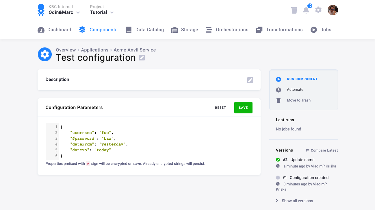
Let’s assume your component accepts the following configuration:
{
"username": "foo",
"#password": "baz",
"dateFrom": "yesterday",
"dateTo": "today"
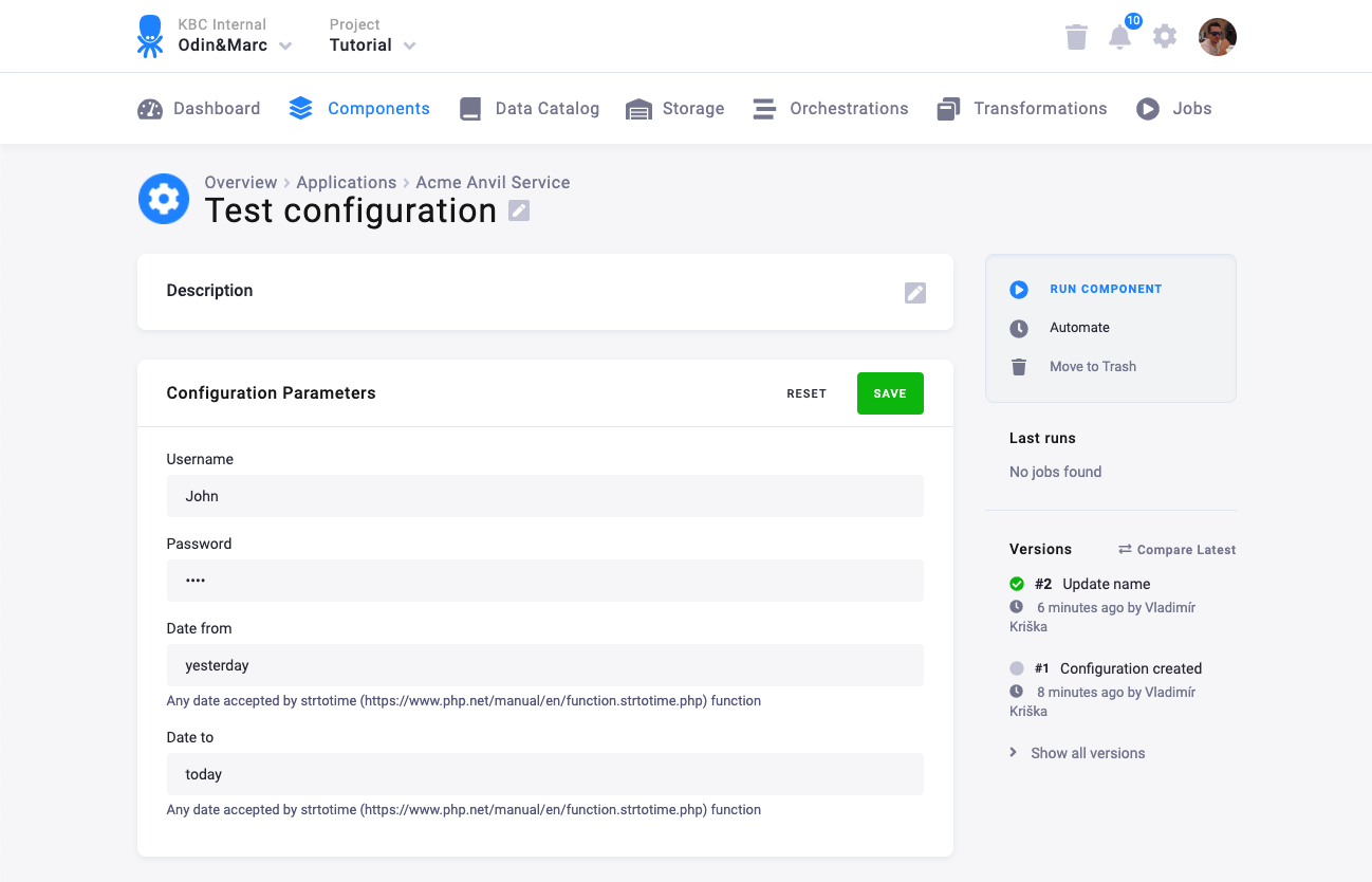
}This looks like an appropriate form:
The form above can be created using this JSON Schema:
{
"title": "Parameters",
"type": "object",
"required": [
"dateFrom",
"dateTo",
"username",
"#password"
],
"properties": {
"username": {
"title": "Username",
"type": "string",
"minLength": 1,
"default": "",
"propertyOrder": 1
},
"#password": {
"title": "Password",
"type": "string",
"format": "password",
"minLength": 1,
"default": "",
"propertyOrder": 2
},
"dateFrom": {
"title": "Date from",
"type": "string",
"description": "Any date accepted by strtotime (https://www.php.net/manual/en/function.strtotime.php) function",
"minLength": 1,
"default": "",
"propertyOrder": 3
},
"dateTo": {
"title": "Date to",
"type": "string",
"description": "Any date accepted by strtotime (https://www.php.net/manual/en/function.strtotime.php) function",
"minLength": 1,
"default": "",
"propertyOrder": 4
}
}
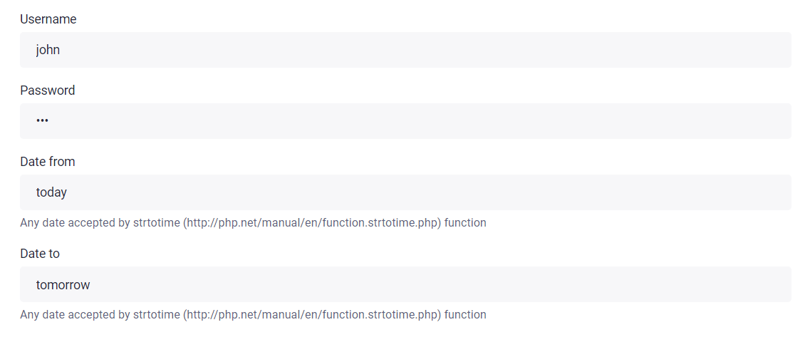
}Links Example
Note: The links feature is deprecated. Use options.documentation instead (see Supported Options).
If you want to provide links to external resources, use options.documentation to add a clickable documentation icon next to the field label:
{
"dateFrom": {
"title": "Date from",
"type": "string",
"description": "Any date accepted by the strtotime function",
"options": {
"documentation": {
"link": "https://www.php.net/manual/en/function.strtotime.php",
"tooltip": "strtotime Documentation"
}
}
}
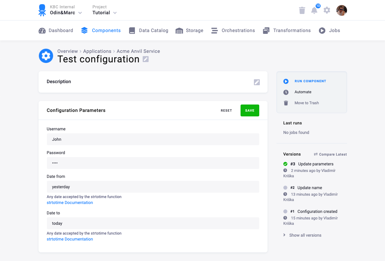
}Legacy links feature (deprecated)
The old links property is no longer supported. If you have existing schemas using it, migrate to options.documentation:
{
    "title": "Parameters",
    "type": "object",
    "required": [
        "dateFrom",
        "dateTo",
        "username",
        "#password"
    ],
    "properties": {
        "username": {
            "title": "Username",
            "type": "string",
            "minLength": 1,
            "default": "",
            "propertyOrder": 1
        },
        "#password": {
            "title": "Password",
            "type": "string",
            "format": "password",
            "minLength": 1,
            "default": "",
            "propertyOrder": 2
        },
        "dateFrom": {
            "title": "Date from",
            "type": "string",
            "description": "Any date accepted by the strtotime function",
            "minLength": 1,
            "default": "",
            "propertyOrder": 3,
            "links": [
                {
                    "rel": "strtotime Documentation",
                    "href": "https://www.php.net/manual/en/function.strtotime.php"
                }
            ]
        },
        "dateTo": {
            "title": "Date to",
            "type": "string",
            "description": "Any date accepted by the strtotime function",
            "minLength": 1,
            "default": "",
            "propertyOrder": 4,
            "links": [
                {
                    "rel": "strtotime Documentation",
                    "href": "https://www.php.net/manual/en/function.strtotime.php"
                }
            ]
        }
    }
}
Which renders like this:
Legacy Features
The following features are still supported for backwards compatibility but have preferred alternatives:
enumSource/watch— Dynamic enum population based on other field values. For new schemas, preferoptions.asyncwith sync actions instead. See Sync Action Examples.
Deprecated Features
The following features from the legacy JSON Editor library are no longer supported:
links— Clickable links on field descriptions. Useoptions.documentationwithlinkand optionaltooltipinstead.